I am no longer using this blog, as I feel it represents me as a student, so I have started a new one which will be my blog as a freelance illustrator.
You can find it here: NEW BLOG
Saturday 12 November 2011
Tuesday 13 September 2011
310 studio
I am now sharing a studio space with my good friends and course mates Chris Howker, Mark Mottershead, Stephen Brown and James Hood! We decided while we were at Uni that we would like to share a space together so that we could benefit from the creative feedback of our peers and also so it didnt feel like we were so rudely thrust into the "real world" all on our own (at least for me anyway!) So we have secured a studio space in Awol studios in Manchester city centre, and the studio is up and running with plenty of cool things happening there.
Check out our blog here: 310-BLOG
Check out our blog here: 310-BLOG
Tuesday 17 May 2011
Facebook page
Hi all, check out the Facebook page for some of my illustrations!
you can see it here: Dan Hodgkinson Illustration
you can see it here: Dan Hodgkinson Illustration
Sunday 15 May 2011
Promo Artefact - Love Cream zine

For my Promo Artefact I abandoned my idea of some kind of totem pole thing for a more practical idea, a colloboration between myself and some of my peers to produce a small magazine with our images in it.
We decided to produce a small magazine using the newspaper club website. Initially the theme to our artwork was going to be "Kurt Russell", we wanted to do something quite random and something totally different to what we had done before. We were just going to have quite a loose starting point, then it evolved into a kind of stalker fan-zine of Kurt Russell, and the results are... well you can see for yourselves.
I have included a copy of the LOVE CREAM magazine, pinned to my display board
Check out the LOVE CREAM facebook page here: LOVE CREAM
LOVE CREAM are:
Mark Mottershead
Stephen Brown
Stephen Nuttall
Chris Howker
and me!
Hopes, Fears and Opportunities
I’m not too sure how to start this so I’ll do as the brief says and use last semesters experience as a starting point. I was very happy with my negotiated project in last semester, I felt as though I was able to properly express my interests in illustration, in terms of what kind of work I want to produce as a freelance illustrator when I graduate. Being able to pick my own brief was brilliant as I was able to choose exactly what I wanted to do. I chose Milton’s “Paradise Lost” as it is a great piece of literature that I had studied at sixth form college, and I had always wanted to make imagery based on it. It was great as I was able to pick the format and make many decisions for myself.
I think the negotiated project came at the perfect time in the course for me. At the end of the second year I was quite disillusioned with the course and my place on it and I could simply not see myself as ever being an illustrator in the “real” world. Many of the projects in the second year I felt were of absolutely no interest to me and although I was learning important lessons, I felt completely at odds with the briefs. I could see no way of making them enjoyable to me and this wasn’t really helped by the fact that my working method was constantly in flux. I was trying many different techniques and mixtures of handmade and digital elements and I never felt comfortable in what I was doing. I did in fact rather dread starting the final year as I was still all over place in terms of my working method.
So when we got handed the brief and I read that we were to write our own project I was very happy and saw it as good chance to get more in touch with exactly what kind of illustration it was I wanted to do, both in terms of content and process. I looked back to my first year [which I enjoyed vastly more than the second] and reminded myself of the projects I really enjoyed, the main one being Sinbad the Sailor. I enjoyed this not just because it was illustrating an adventure story, but because of the briefs’ simplicity. It was basically picking interesting lines/quotes from the story and creating images to go along with them. I really enjoyed the directness and pragmatic nature of this type of illustration, and hugely preferred it over the more concept lead editorials, which seemed very dry and uninteresting to me.
Looking back to the Sinbad the Sailor brief, I decided to write a similar brief for the third year Negotiated project, in which I would illustrate quotes from a story, and as I said earlier I had always wanted to make pictures based on Paradise Lost, and so that project came into being. I also wanted to return to the printmaking I had done in the first year on the Sinbad brief, and so decided to make the images as collographs. Another important breakthrough was that I discovered I had a bit of a knack for doing very fine, pattern like linework, while doing the 7x7 brief. So, armed with my new found skills and hunger to get making collographs, I set out to make my Paradise Lost images, which I think are successful, and they received positive feedback from my London visit.
After the conclusion of the Negotiated Project, I felt much better about my work and how it was that I was going to fit into the industry. I could see myself working on real briefs with the techniques I had developed, and on commissions that I was interested in, such as publishing work.
I did hit a bit of a wall again in the Major Project however, and this was nothing to do with the brief as again, it was one we had written ourselves. Rather, it was with my working method again. I was creating images for the first two of my Chinese Fairy Tales, and they were comprised of different techniques, such as lino cut, illustrator shapes, linework, and collographs, all assembled in Photoshop. For some reason I became very disillusioned with working like this, and just did not enjoy cobbling the various elements together. I felt as though I liked the individual elements, but that they completely lost all character, and lost everything I liked about them, when I assembled them in an image on the computer.
And so it was this, and a bit of a Eureka moment when watching a video of Illustrator Jake Blanchard doing lino cutting, that led me to decide to do all my images as full lino cuts. I was very happy with this working method, and realised that cutting the images actually doesn’t take that long, and that it is something I could easily continue at home, and that I loved the process and effect, and that there seems to be very little heavy Photoshop work to be done! All pros really.
Obviously I need to factor into this the reality of commissions in the real world, but I am still learning and I know I will become more and more able with the process and with making it as flexible as possible.
Going to London was a massive confidence boost and sort of life-changing moment for me. I went to London round about the time I was disillusioned with my working method on the major project. However after meeting with several potential clients such as Billington Cartmell and Faber & Faber, and hearing their very, very nice comments and great advice, I was injected with a new life and really wanted to get on with making some great images with lino printing for my major project. To hear clients who see a LOT of illustration on a daily basis say that your work is good is a massive confidence boost, and it really gave me a lot of hope, and allowed me to see myself as succeeding as a freelance illustrator in reality.
The advice we received was really good and I feel confident to make a good physical portfolio and go and see clients both locally and in London, and I also feel very confident in self promotion, using business cards, PDF portfolio’s, and other methods to get myself noticed. As much as I have really enjoyed this degree and I will certainly miss many things about it, I am also very eager to get myself out in the real world and get commissions and face the challenges that being a freelance illustrator has to offer, and to gain the confidence that will surely come from completing commissions that a client is happy with.
Obviously I am not without fear by any stretch of the imagination, and I am scared of letting a client down or not being able to come up with good ideas for a brief or mainly, just not being noticed and getting no work. However, I see it as a reap-what-you-sow situation and I am ready to put the hard work in to get the most back out, and now I simply cannot wait to get out there and do it.
Contacts with Commissioning Clients #4
The Chase
Earlier in this semester we had a presentation by Lise Brian of The Chase agency.
The presentation itself was massively helpful, Lise gave us great advice on how to get in touch with art directors and other commissioning clients and how to best organise meetings with them. She also gave us great tips on our portfolio's, both physical and in PDF format. She then took us through our portfolio's one to one, and again gave us some brilliant advice and very nice, confidence boosting comments. This was my first contact with a commissioning client and one I won't forget as I was on a confidence high after speaking with Lise.
check out The Chase here: http://www.thechase.co.uk/homepage/index.php
Contacts with Commissioning Clients #3
Billington Cartmel
On the monday evening of our trip we went to see Tom Genower and his colleagues at the agency Billington Cartmel. This was kindly set up by Steven Nuttall, so thanks Ste!
They had some brilliant comments for us on the industry, commissioning clients, and some really kind comments for us on our work. It was a very relaxed atmosphere and the guys gave us a huge slice of time for which I am really grateful. It did my confidence a world of good to hear their comments.
check Billington Cartmel out here: http://www.bcl.co.uk/
check Tom Genower out here: http://www.monsters.co.uk/details/details.php?id=8
Contacts with Commissioning Clients #2
Big Orange
Again on the Tuesday of our London visit, we went to see Robin Heighway-Bury and Paul Davis at Big Orange Illustration.
They were very welcoming and again gave us some brilliant advice about our portfolio's and how to present them. Also there was much informative and useful comment on the nature of being an illustrator and the industry itself, which was both useful and also quite scary!
It was great to see a working studio with illustrators getting on with commissions around us and made me want to set up a studio with my peers, which is something I do hope to do in the future.
Contacts with Commisioning Clients #1
Faber and Faber
On the Tuesday of our trip to London we visited art director Donna Payne and her colleagues at Faber and Faber. They were very gracious hosts [even offering us biscuits!] and gave us a huge chunk of there surely very busy schedule.
It was a very informative and interesting meeting at which Donna and her colleagues took us through the process of commissioning an illustrator and the nature of the communication between illustrator, publisher, and client. I must admit I was quite nervous at first but soon I realised they are just normal and very nice people and I felt much more confident about approaching similar people in the future. Also they all had very kind words for us regarding our work, and also very useful advice as well, about both our physical and PDF folio's.
Additionally, it was very interesting to see their offices and what kind of working environment they had.
A huge thanks to Donna and her co-workers at Faber and Faber.
Major Project: Final Images w/Roughs - Image 5 "The Lady of the Moon"


This was one of the tougher images to do. I had the basic overall idea down pretty soon, I wanted a big sun in the sky and an archer shooting it down. As you can see I toyed with the idea of having the bow and arrow on its own and no figure but I thought this was a little bit abstract and so I was looking for a way to have a figure shooting an arrow at the sun. Due to the format, having the figure shooting form one of the bottom corners to the opposite top corner just wasn’t working, and so I thought it would look good to have him firing straight up in the air. This worked as it looked quite nice visually and also evoked how awkward and difficult shooting an arrow at the sun would be if it was directly above you [not to mention how far away it is obviously]. It gave the character a nice awkward look and I knew I could have him squinting and looking as though it was a difficult task.
The tough bit however was making the figure work. Initially having the figure shooting straight up in the air was making him look as though he was lying flat on his back. I needed him to look as though he was stood up straight, but firing directly upwards. And then came the problem of how his hands were holding the bow, and how this was in relation to the rest of the figure. The more realistic poses had the arms and face all in line with each other [how you would fire a bow in real life] but this was making the silhouette of the limbs and body very confused and melding them together and it just wasn’t working right. I had done some others that worked a little better but were less realistic in terms of how to fire a bow, and after some tutor advice decided this was the way to go.
I also wanted to make sure that the figure was made of mostly straight lines to evoke the tension and strain the character would be feeling when attempting to fire an arrow at the sun.
As you can see from the final image, this is clearly not how one would fire a bow in reality but I think the figure looks a lot better and it really evokes the difficulty and awkwardness of what he is doing.
Images Copyright Dan Hodgkinson 2011
Major Project: Final Images w/Roughs - Image 4 "The Great Flood"


This is another image that came fairly easily to me, there is only one rough here because there are a couple of very small thumbnails in my sketchbook and the rest I was drawing on the lino and then erasing it and drawing over, I should of photocopied them to show the progression but I didn’t but enough of that, on with the post...
As I said, it came fairly easily to me as I knew I wanted to have the stone lino with its eyes red, as in the story when the lion statue’s eyes glow, the flood will come. So with it being very narratively driven, I knew I needed to have the lion statue and something to show a flood. At first I had a sort of wavy water line as you can see from the rough, and I was going to have the everything above the water line being opposite to everything below, in terms of positive/negative with the black and white. However after some discussion with tutors I added the wave to make the flood look a little more violent. Also it looked nice in some of the roughs to have the lion facing away from the wave as if unaware of its fate, so that stuck.
Obviously you can see how the Lion is very different from the rough to the final. This is similar to what I commented on in the last post in that I decided not to completely steal a Chinese style lion as it would be too direct a symbol of Chinese culture. Instead I made a more western looking lion but I think it works well. I also decided to have the lion on some sort of plinth to symbolise the fact that its meant to be a statue of a lion, not an actual lion.
Images Copyright Dan Hodgkinson 2011
Major Project: Final Images w/Roughs - Image 3 "The Disowned Princess"


This image came fairly easily compared to the others, when I read the line from the story “at once a warrior emerged from the waves” I instantly had a very clear mental picture of what it could look like. Obviously there are many comparisons with Moses parting the red sea so it’s not an unfamiliar image to me and I knew I wanted a strong character with an expressive pose. I started with the figure in the corner and the road leading away from him, as in the story he parts the waves for the protagonists to progress on their journey.
However I soon realised that it looked nice to have the warrior central, gesturing straight up with his sword and the road coming towards the viewer in perspective.
What didn’t come easily however was how to do the waves. I tried many different versions drawing directly onto the lino [fool] but they just weren’t working and so eventually I came upon some very eastern looking waves in a woodblock print and so decided to use those. I think they work nicely however the waves above the warrior need to be refined. I wanted to have some waves looking as though they were just peeling away either the side of the warrior, and them some crashing away from him more violently, but the more dramatic ones [spirally ones] need some refinement.
Overall I am happy with the image but it does need refinement of the waves in my opinion.
One of my objectives was not to make the images too Eastern or “chinesey” for want of a better adjective, because they were illustrating Chinese fairy tales and I was using Chinese propaganda posters as a point of reference, I didn’t want them to borrow from these influences too rapaciously. I still wanted the elements to be mine but just have flavours of the influences apparent.
This image probably has the most as the armour of the warrior is based on Chinese armour and as I said the waves are very eastern, but I think overall it is balanced. I am happy with how the figure seems to evoke the propaganda posters in its strong, dramatic pose, and it can be said of all the images that the black and red is very reminiscent of those posters.
One criticism I have of this piece however, is that it has a lot more black in it and is quite pattern heavy on the eye, so that is another thing to consider if I revise this image in the future.
Images Copyright Dan Hodgkinson 2011
Major Project: Final Images w/Roughs - Image 2 "The Cave of Beasts"


This is again an image that I had already worked on and had a good idea for, so it was basically a matter of refining it and converting it to the lino. My main objectives with this image both when I was working on it before I made the decision to do solely lino’s, and afterwards, was to make the shape of the kettle right, and to get the wolf inside the kettle right also. I needed to make the kettle read as a kettle to the viewer but also to not make it look too much like a teapot. Also twinned with this problem was the problem of the shape of the wolf. After going through the earlier, non-lion versions, I was aware that the wolf just wasn’t right and it didn’t look enough like a wolf, and it could have done with looking more foetal inside the kettle.
So I went about solving the problem with many drawings of the image [again the roughs here don’t represent the amount of drawings I did] and slowly I began to get a feel for the wolf and how it could be more foetal. I am quite happy with the wolf in the final image, although I think I could deal with its shape slightly better, as its legs are hidden at the moment, although this was to give it an overall more streamlined foetal shape, I think the viewer could read it better with legs. Also I think upon reflection I could have included more marks to represent its fur.
I am happy with the overall shape of the kettle and the steam issuing from the spout, but if I was to tackle the image again, I would probably refine the flames and the wolf inside the kettle.
Images Copyright Dan Hodgkinson 2011
Major Project: Final Images w/Roughs - Image 1 "The Bird with Nine Heads"


This is the first of the five images that I have created for my major project, and one that (as you can see from my previous posts) I have already done work on. As I said in a recent post I made the decision to do my images as full lino cuts, instead of cobbling them together from different techniques. I think this way they have a more unified feel and I don’t have to worry about elements not working together etc.
So I decided that my old idea just wasn’t working with the bird as a central motif and the elements like the sword and the needle supporting it. I decided to go for a more organic composition with the sword as a central element that gives the image a straight, central line, to which the more organic forms of the birds heads intertwine and wrap around.
This was quite difficult and I would like to stress that the roughs included here are only a small collection of the drawings that I did for the image. I seemed to ahve a nice composition when I got to about 6 heads , then fitting the last 3 in was quite difficult. However I think this forced me to be quite creative in how I was going to fit them in, and choosing to have some of the heads as being severed not only added to the narrative of the image [as this is what happens in the story] but allowed the heads to fit in quite nicely.
I think the elements work well as the sword [while being a narrative element] also symbolises the strength and bravery of the main character and the small love heart in the hilt symbolises his love for the princess that he saves.
Equally I think the birds heads work well as I based them roughly on vultures to give them a horrible monstrous feel. Obviously there is always room for improvement and there is other ways I could have dealt with the necks wrapping around the sword etc, but on the whole I am happy with the result.
Images Copyright Dan Hodgkinson 2011
ShellsuitZombie
While in London we had a very special evening with ShellsuitZombie, which is a “project run by graduate creatives that encourages interaction between graduating students and the creative industry”. The evening was very light hearted and tongue in cheek and full of alcohol and laughs but they had a serious point that they got across in their presentation about the relationship between the recently graduating students, and the creative industry. To hear their thoughts on this matter and get their advice was really helpful and it was a great opportunity to speak to some down to earth guys about the industry that we will soon be stepping in to.
Check out there website here:
http://www.shellsuitzombie.co.uk/
Check out there website here:
http://www.shellsuitzombie.co.uk/
Andrew Pavitt


Also at the British Library we got a chance to speak to illustrator and tutor Andrew Pavitt who was a very nice bloke and gave us some very useful and relevant advice both on our work and how it was presented, it was great to get another opinion on our work and again a great confidence boost to receive positive comments. Also to hear another persons comment on the industry and what is necessary to succeed was extremely useful and appreciated.
you can see Andrew's great work here
http://www.andrewpavitt.com/e1.html
Gillian Blease


While in London we met up with Gillian Blease who is a prolific illustrator and a very nice lady to boot. We met as a group in the British Library and she talked to us in groups of threes, and went through our portfolio’s one at a time. She gave us some really great advice both on the work and the presentation of our portfolios and it was a great confidence boost also to have such a well-known illustrator say really kind things about your work. Also it was great to hear about her work and to have her talk us through it and explain the ins and outs of the different commissions, and the problems faced and how they were overcome, it was a great insight into the industry.
You can see Gillian's brilliant work here
http://gillianblease.co.uk/illustrations.php
Edward Bawden


Also during my research I have looked at Edward Bawden. He has done some fantastic prints and some are used on the London Underground stations as tile motifs. This is something I would love to explore the possibilities of, with regards to my own work being displayed on walls (whether legally or illegally remains to be seen).
His prints are really great and his use of negative and positive space really brings them to life and makes them great to spend a while looking at.
Eric Ravilious


As part of my research I looked up the brilliant Eric Ravilious. Obviously his work here are engravings so not exactly what I am doing but brilliant none the less. His black and white work is the stunning and very balanced, and his use of composition and the marks he uses to create texture are fantastic. I think one of the things I need to explore is using different marks in my lino cuts to express texture.
Tuesday 10 May 2011
Ben Jones Interview

Recently I posted about illustrator Ben Jones, and even more recently I emailed him with some questions to which he very kindly replied with some great comments and advice. A huge thank you to Ben for taking the time to share his thoughts!
Here are his comments:
What are the main influences to your work at the moment, both personal and commissioned?
My main influences are Mythology and fairy tales it is the main drive in my personal work. When it comes to commissions its very hard to convey your interests and influences as art directors normally have something in mind before hand. I also love Polish illustration which I am sure you have seen many many times! Oh and also print is a very important influence of mine.
How important do you find “networking” with other people in the industry to be?
In a word, very! Its important when getting commissions to build a relationship with art directors and to do a good, professional job. I still talk to a few people that have commissioned me in the past.
How much do you concentrate on self promotion and have you ever gained a commission from an unexpected or untraditional source?
I have been shit with self promotion over the last year or so. It is the most important thing to do baaaaaaaaa!!!! have no more than 100 places you would like to work for and send emails 3 times a year telling them what your up to and a link to a simple website with no more than 30 images. Also it is a good idea to send out cards a few times a year just don't pester people is the main thing. check out this. I did get a unexpected commission from TFL when showing work at an AOI show I would just say get involved with cool things. But don't do commissions for free from big publications its killing the industry.
Do you think there has been a shift back to hand made imagery and print techniques due to the abundance of digital imagery being produced?
Hand made has always been around even when digital was the be all and end all check out Jeff fisher and Paul Davis. I think there has been a change in astetics there are great illustrators using photoshop to create work that looks like its been done by hand like Stuart Kolakovic. for me it is because I get board on photoshop and like to make allot of mess.
How do you find working to strict deadlines using more time-consuming methods such as printmaking?
I never really spend more than a day or 2 on a peace of work so its fine for me. Once you finnish Uni you start to make work quicker and quicker. When I was a Stockport the idea of having a day to do an illustration was shit scary.
Again a massive thank you to Ben for spending his time answering the questions and supplying some great advice, it is VERY much appreciated!
Check out his work here:
http://illustrationbenjones.blogspot.com/
Jake Blanchard Interview


I recently came across an Illustrator named Jake Blanchard when I saw a video regarding his latest exhibition "Hylozoism". I thought Jake's work was grand and was particularly interested as he talks about using lino cut in the video, and also some thoughts on freelancing in general. So, I sent him an email and he very graciously replied! Here are his answers to my qusetions:
What are the main influences to your work, both personal and commisioned?
I guess the most obvious influences on my work are nature, tribal society, mythology etc etc, I grew up in the Peak District so that had a big impact. But I'm also hugely interested in music, particularly experimental stuff, drone, free jazz etc, and Biology and theoretical physics are often on my mind even if that doesn't necessarily show all too often in my work.
How important do you find “networking” with other people in the industry to be?
I think I'm pretty active in terms of keeping in touch with other illustrators, collaborating and commissioning. For me it's a really important part of my life, and I get a real kick out of promoting the work of other illustrators that I love. Thats why I run Tor Press, as a way of working with other illustrators and musicians that I love.
How much do you concentrate on self promotion and have you ever gained a commission from an unexpected or untraditional source?
I used to do a huge amount of self promotion, more than anyone else I know, I have posted out in the region of 2000 hand printed postcards in the past 3 years (although a lot of those were in packs of 3-5). I've been a little less active with mailouts recently although I do plan on doing more soon. It's a great way to get the attention on potential new clients and I have always really enjoyed a bit of post.
I first became aware of you when I saw the video for your current exhibition “Hylozoism”, where you talked about printmaking and lino cut in particular. In a time when so much illustration is produced with the click of a mouse, do you think that hand-made imagery has seen a resurgence in popularity?
Hand made imagery will always be around, even a lot of computer based works begins or directly comes from hand drawn works. All of my work for example. (although most of it goes through a computer at some stage) is hand drawn. I don't think it's a good thing to draw a comparison between the two. The computer is just another tool, I love working in different mediums, screen print, lino, painting, drawing, digital and wood carving, there's always more to learn and new things to try, it keeps it fresh.
I can't thank Jake enough for this brilliant reply, it is very much appreciated!
Check out his amazing work here
http://www.jakeblanchard.co.uk/
Monday 2 May 2011
Major Project - update


While making the images for the first two Chinese fairy tales I am illustrating (The Bird With Nine Heads & The Cave Of Beasts) I became quite disillusioned and unhappy with the way I was working. I was making elements using different techniques and then arranging them on photoshop, the lino cut bird and sword from my recent post are an example of the lino cut elements, and then as you can see from the images in this post, they became part of a larger image using other elements such as illustrator shapes and linework.
For some reason, I would always be happy with the individual elements, but then when I arranged them in photoshop, I would never be happy with the image as a whole. I struggled to find out why, I thought it was because there was several different techniques included, but then upon reflection, I think the techniques sit fairly well together. There was several other things going round in my head as to why I wasn't happy with the images and I just couldn't put my finger on it. It was especially strange as I had really been proud of my paradise lost images that combined different techniques. Then it struck me that the Paradise Lost images were very simple in their creation, I would make a collograph, and then do some separate linework, and place it over the top in photoshop. However with the Chinese fairy tale images, I was using several different methods and I think it was just too much, I think they were competing for my attention and even though some elements sat nicely together, they were just not working as a whole.
So while I was watching a video on Lino cut illustrator Jake Blanchard, I decided to take on the challenge of doing all my images in Lino cut. This way, the most I would be doing digitally would be to drop some line work in (as with the PL images), and so hopefully I would regain what was making those images work both as illustrations, and work for me as a practitioner.
So as I said, included here are my first couple of illustrations and maybe you can see for yourself what I'm talking about, or maybe it wont make any sense!
Watch this space for upcoming posts regarding my recent visit to London with college and for new roughs for my Lino cut images!
Saturday 19 March 2011
Ben Jones


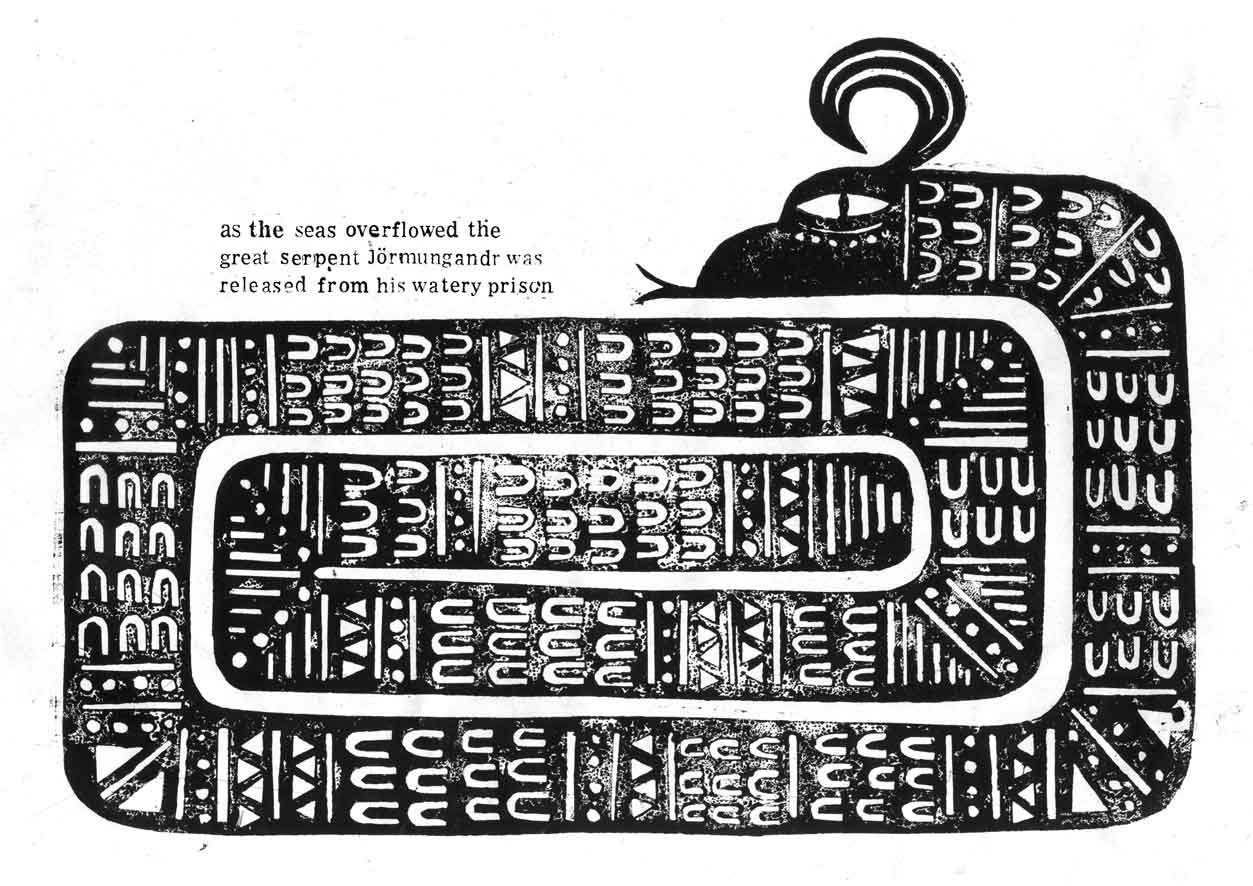
Some more research here on artists/illustrators using Lino cut. My tutor Ian told me of an ex-student of Stockport college called Ben Jones, who uses the technique.
I think his work is fantastic, I have included some images here, great use of black and white and limited colour, and great use of the technique as well! Here the analogue and printed aesthetic of the work really shines and I think these images are fantastic.
The way Ben represents the elements of the illustration are mint, his wolf and snake are really, really nice, I have more than a spot of jealousy for this work! Also the content of them (Norse mythology) really appeals to me.
You can check out his work here
http://illustrationbenjones.blogspot.com/
Daniel Pudles - Lino cuts


As I have been doing Lino cuts for my latest project, I've been looking at some great Lino cuts by illustrators. Here are some images by Daniel Pudles, they are fantastic images and I picked these ones in particular as they are limited in colour and use white, black and red, which are the colours I intend to use for my Chinese Fairy Tale images.
I particularly like how they have been printed in different stages and have an "offset" look about them. It gives them a really nice aesthetic feel and depth.
You can find Daniel's work here;
www.danielpudles.co.uk
Lino Printing - Thoughts


Looking at some of the Chinese Propaganda posters, I noticed that some of them looked as though they were Lino cuts, and so I decided to have a go at one myself. I have wanted to try this technique for some time and my tutor Gary thought it would be a good idea.
So I acquired some lino and a cutter and began making the bird for my image “the bird with nine heads”. The technique proved to be a very therapeutic one at times, but also very taxing at the same time! I literally put my blood and sweat into doing it as I cut myself many times with the cutter.
However, as a whole I greatly enjoyed the process and the results are really nice. In terms of time, they are quite time consuming, but I think that they can be done within a reasonable time frame to accommodate a client in the “real world”. I will hopefully include some form of Lino cut in each image to give a nice feeling of continuity within the series.
I feel as though I relinquished quite a lot of control during the making of the Lino cut, however this may have been a positive thing as it forced me to work slightly differently than I would with collograph or line work.
Also, I think that the Lino cuts fit in nicely with my collographs and linework, they are not massively contrasting and work nicely together, so hopefully this is something I can add to my arsenal of techniques, to use in the future.
Sunday 13 March 2011
Finally posted again! Major Project!


OK so I haven't posted since Christmas Eve, plenty of stuff has happened but I haven't got round to putting it up because of...well laziness I guess. So here goes, theres tons to say so I'll do it in several posts to minimise how much there is on each post.
Regarding my Major Project, I initially considered doing a Chinese zodiac calendar, and I would have 12 illustrations, one for each animal of the zodiac. However, after talking to Ian, he suggested that it would be a bit of a pastiche, and would basically just be "my version" of a Chinese calendar, and essentially just a vehicle to draw animals. Now, personally, neither of these things bother me and I know I could still make nice images from them. However, I respect the wisdom of my tutors and as such decided to heed their advice.
Ian had given me several books regarding Chinese horoscopes and astrology etc and one of these happened to be a book of Chinese Fairy Tales. I read a few of them and they were really interesting, and I decided to propose that I illustrate 5 of them as my major project, which Ian thought was a good idea. So, that's what I'm doing. I read through the book and picked out 8 of them that I thought were the best to make into images or had the most interesting content and set about starting one of them, called "The Bird With 9 Heads".
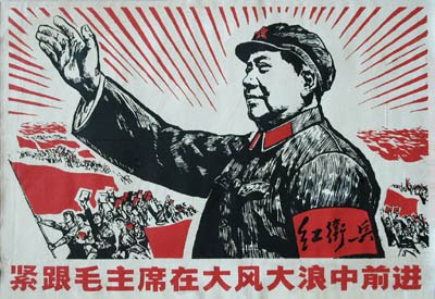
I had several objectives with this project, firstly I wanted to use Chinese Propaganda to inform the colour and composition of the images. I have included several in this post so you know what I mean. I was looking through a book on Chinese propaganda and several of the images grabbed my attention in terms of the great use of limited colour and in some ways they reminded me of my own work. I thought they would be a great thing to inform my work and to get colour, however limited, into my work [especially as my Negotiated Project was completely monochromatic]. I did however want to make sure that they weren't "fairy tales in the style of Chinese propaganda posters", but that they were just influenced by them, just a small nod to these influences.
Secondly I wanted to inject some modern elements into my work, for the benefit of my portfolio. A lot of what I enjoy is ancient or medieval, and my work doesn't usually include things like mobile phones or computers. So I wanted to subtly include modern elements into the illustrations, even something like modern skyscrapers that might be found in China alongside traditional pagodas. In this way, not only would I be tackling modern elements, but also modernising the story itself, bringing these very old, traditional stories into the modern day, and as such giving this whole thing a "point". One thing I find hard about illustration on this course is giving things a "point", doing them for a reason. In the real world the reason for the images is dictated by the client, as is the audience, but on the course, I have to make these things up which I find hard because I just want to make attractive images for my portfolio. Clearly if they did have a point, that would maybe help potential clients to see where my work could be used, but again, I think in reality they would do that anyway.
Anyway, I digress... So the point of the images would become to modernise the stories so that they are not forgotten, and the lessons that they teach us are not lost. This leads me to the third objective, which was to suggest these morals and values, such as Honesty, Integrity, Loyalty and Courage to name a few.
However, I came to a point when I was sketching in my book that the many things I was trying to get across were just too much, they were making my brain liquidise and dribble out of my ear. I was trying to;
a) Inject a flavour of Chinese propaganda posters and use them to inform colour and composition.
b) Create some elements that were modern to show that I could illustrate such things.
c) In doing this, modernise the stories so that they are not forgotten.
d) Somehow evoke the morals/values of the story.
Now, this was just way too much for me to handle and it was actually blocking my progress on the project, so I just began making images to see where they led me.
I have come to the realisation that I am quite a surface level illustrator, and I am not ashamed to admit it. I would say I am more of a decorator, but that I think reflects my tastes as a viewer of art and illustration also. I am no Noma Bar. I don't do clever visual puns or subliminal messages. I would say my illustration was fairly direct, but I'm comfortable with that and that's the illustrator I want to be. So as I said earlier, I just got on with making the images and decided if the opportunity presented itself to include modern elements or morals, I would try to include them, but I wouldn't force it.
So I got on with making my image, and have since pretty much completed the "bird with 9 heads". I will include an image in my next post.
Subscribe to:
Posts (Atom)
