OK so I haven't posted since Christmas Eve, plenty of stuff has happened but I haven't got round to putting it up because of...well laziness I guess. So here goes, theres tons to say so I'll do it in several posts to minimise how much there is on each post.
Regarding my Major Project, I initially considered doing a Chinese zodiac calendar, and I would have 12 illustrations, one for each animal of the zodiac. However, after talking to Ian, he suggested that it would be a bit of a pastiche, and would basically just be "my version" of a Chinese calendar, and essentially just a vehicle to draw animals. Now, personally, neither of these things bother me and I know I could still make nice images from them. However, I respect the wisdom of my tutors and as such decided to heed their advice.
Ian had given me several books regarding Chinese horoscopes and astrology etc and one of these happened to be a book of Chinese Fairy Tales. I read a few of them and they were really interesting, and I decided to propose that I illustrate 5 of them as my major project, which Ian thought was a good idea. So, that's what I'm doing. I read through the book and picked out 8 of them that I thought were the best to make into images or had the most interesting content and set about starting one of them, called "The Bird With 9 Heads".
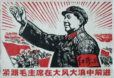
I had several objectives with this project, firstly I wanted to use Chinese Propaganda to inform the colour and composition of the images. I have included several in this post so you know what I mean. I was looking through a book on Chinese propaganda and several of the images grabbed my attention in terms of the great use of limited colour and in some ways they reminded me of my own work. I thought they would be a great thing to inform my work and to get colour, however limited, into my work [especially as my Negotiated Project was completely monochromatic]. I did however want to make sure that they weren't "fairy tales in the style of Chinese propaganda posters", but that they were just influenced by them, just a small nod to these influences.
Secondly I wanted to inject some modern elements into my work, for the benefit of my portfolio. A lot of what I enjoy is ancient or medieval, and my work doesn't usually include things like mobile phones or computers. So I wanted to subtly include modern elements into the illustrations, even something like modern skyscrapers that might be found in China alongside traditional pagodas. In this way, not only would I be tackling modern elements, but also modernising the story itself, bringing these very old, traditional stories into the modern day, and as such giving this whole thing a "point". One thing I find hard about illustration on this course is giving things a "point", doing them for a
reason. In the real world the reason for the images is dictated by the client, as is the audience, but on the course, I have to make these things up which I find hard because I just want to make attractive images for my portfolio. Clearly if they did have a point, that would maybe help potential clients to see where my work could be used, but again, I think in reality they would do that anyway.
Anyway, I digress... So the point of the images would become to modernise the stories so that they are not forgotten, and the lessons that they teach us are not lost. This leads me to the third objective, which was to suggest these morals and values, such as Honesty, Integrity, Loyalty and Courage to name a few.
However, I came to a point when I was sketching in my book that the many things I was trying to get across were just too much, they were making my brain liquidise and dribble out of my ear. I was trying to;
a) Inject a flavour of Chinese propaganda posters and use them to inform colour and composition.
b) Create some elements that were modern to show that I could illustrate such things.
c) In doing this, modernise the stories so that they are not forgotten.
d) Somehow evoke the morals/values of the story.
Now, this was just way too much for me to handle and it was actually blocking my progress on the project, so I just began making images to see where they led me.
I have come to the realisation that I am quite a surface level illustrator, and I am not ashamed to admit it. I would say I am more of a decorator, but that I think reflects my tastes as a viewer of art and illustration also. I am no Noma Bar. I don't do clever visual puns or subliminal messages. I would say my illustration was fairly direct, but I'm comfortable with that and that's the illustrator I want to be. So as I said earlier, I just got on with making the images and decided if the opportunity presented itself to include modern elements or morals, I would try to include them, but I wouldn't force it.
So I got on with making my image, and have since pretty much completed the "bird with 9 heads". I will include an image in my next post.