Showing posts with label Research. Show all posts

Sunday, 15 May 2011

Edward Bawden


Also during my research I have looked at Edward Bawden. He has done some fantastic prints and some are used on the London Underground stations as tile motifs. This is something I would love to explore the possibilities of, with regards to my own work being displayed on walls (whether legally or illegally remains to be seen).

His prints are really great and his use of negative and positive space really brings them to life and makes them great to spend a while looking at.

Eric Ravilious


As part of my research I looked up the brilliant Eric Ravilious. Obviously his work here are engravings so not exactly what I am doing but brilliant none the less. His black and white work is the stunning and very balanced, and his use of composition and the marks he uses to create texture are fantastic. I think one of the things I need to explore is using different marks in my lino cuts to express texture.

Saturday, 19 March 2011

Ben Jones


Some more research here on artists/illustrators using Lino cut. My tutor Ian told me of an ex-student of Stockport college called Ben Jones, who uses the technique.

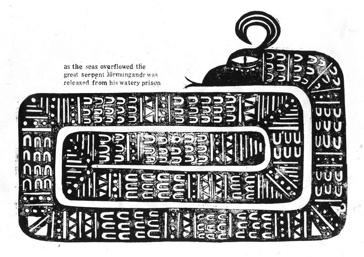
I think his work is fantastic, I have included some images here, great use of black and white and limited colour, and great use of the technique as well! Here the analogue and printed aesthetic of the work really shines and I think these images are fantastic.

The way Ben represents the elements of the illustration are mint, his wolf and snake are really, really nice, I have more than a spot of jealousy for this work! Also the content of them (Norse mythology) really appeals to me.

You can check out his work here

http://illustrationbenjones.blogspot.com/

Daniel Pudles - Lino cuts


As I have been doing Lino cuts for my latest project, I've been looking at some great Lino cuts by illustrators. Here are some images by Daniel Pudles, they are fantastic images and I picked these ones in particular as they are limited in colour and use white, black and red, which are the colours I intend to use for my Chinese Fairy Tale images.

I particularly like how they have been printed in different stages and have an "offset" look about them. It gives them a really nice aesthetic feel and depth.

You can find Daniel's work here;

www.danielpudles.co.uk

Lino Printing - Thoughts


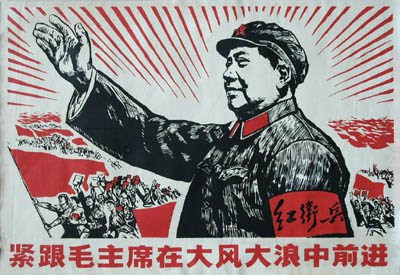
Looking at some of the Chinese Propaganda posters, I noticed that some of them looked as though they were Lino cuts, and so I decided to have a go at one myself. I have wanted to try this technique for some time and my tutor Gary thought it would be a good idea.

So I acquired some lino and a cutter and began making the bird for my image “the bird with nine heads”. The technique proved to be a very therapeutic one at times, but also very taxing at the same time! I literally put my blood and sweat into doing it as I cut myself many times with the cutter.

However, as a whole I greatly enjoyed the process and the results are really nice. In terms of time, they are quite time consuming, but I think that they can be done within a reasonable time frame to accommodate a client in the “real world”. I will hopefully include some form of Lino cut in each image to give a nice feeling of continuity within the series.

I feel as though I relinquished quite a lot of control during the making of the Lino cut, however this may have been a positive thing as it forced me to work slightly differently than I would with collograph or line work.

Also, I think that the Lino cuts fit in nicely with my collographs and linework, they are not massively contrasting and work nicely together, so hopefully this is something I can add to my arsenal of techniques, to use in the future.

Sunday, 13 March 2011

Finally posted again! Major Project!


OK so I haven't posted since Christmas Eve, plenty of stuff has happened but I haven't got round to putting it up because of...well laziness I guess. So here goes, theres tons to say so I'll do it in several posts to minimise how much there is on each post.

Regarding my Major Project, I initially considered doing a Chinese zodiac calendar, and I would have 12 illustrations, one for each animal of the zodiac. However, after talking to Ian, he suggested that it would be a bit of a pastiche, and would basically just be "my version" of a Chinese calendar, and essentially just a vehicle to draw animals. Now, personally, neither of these things bother me and I know I could still make nice images from them. However, I respect the wisdom of my tutors and as such decided to heed their advice.

Ian had given me several books regarding Chinese horoscopes and astrology etc and one of these happened to be a book of Chinese Fairy Tales. I read a few of them and they were really interesting, and I decided to propose that I illustrate 5 of them as my major project, which Ian thought was a good idea. So, that's what I'm doing. I read through the book and picked out 8 of them that I thought were the best to make into images or had the most interesting content and set about starting one of them, called "The Bird With 9 Heads".

I had several objectives with this project, firstly I wanted to use Chinese Propaganda to inform the colour and composition of the images. I have included several in this post so you know what I mean. I was looking through a book on Chinese propaganda and several of the images grabbed my attention in terms of the great use of limited colour and in some ways they reminded me of my own work. I thought they would be a great thing to inform my work and to get colour, however limited, into my work [especially as my Negotiated Project was completely monochromatic]. I did however want to make sure that they weren't "fairy tales in the style of Chinese propaganda posters", but that they were just influenced by them, just a small nod to these influences.

Secondly I wanted to inject some modern elements into my work, for the benefit of my portfolio. A lot of what I enjoy is ancient or medieval, and my work doesn't usually include things like mobile phones or computers. So I wanted to subtly include modern elements into the illustrations, even something like modern skyscrapers that might be found in China alongside traditional pagodas. In this way, not only would I be tackling modern elements, but also modernising the story itself, bringing these very old, traditional stories into the modern day, and as such giving this whole thing a "point". One thing I find hard about illustration on this course is giving things a "point", doing them for a reason. In the real world the reason for the images is dictated by the client, as is the audience, but on the course, I have to make these things up which I find hard because I just want to make attractive images for my portfolio. Clearly if they did have a point, that would maybe help potential clients to see where my work could be used, but again, I think in reality they would do that anyway.

Anyway, I digress... So the point of the images would become to modernise the stories so that they are not forgotten, and the lessons that they teach us are not lost. This leads me to the third objective, which was to suggest these morals and values, such as Honesty, Integrity, Loyalty and Courage to name a few.

However, I came to a point when I was sketching in my book that the many things I was trying to get across were just too much, they were making my brain liquidise and dribble out of my ear. I was trying to;

a) Inject a flavour of Chinese propaganda posters and use them to inform colour and composition.
b) Create some elements that were modern to show that I could illustrate such things.
c) In doing this, modernise the stories so that they are not forgotten.
d) Somehow evoke the morals/values of the story.

Now, this was just way too much for me to handle and it was actually blocking my progress on the project, so I just began making images to see where they led me.

I have come to the realisation that I am quite a surface level illustrator, and I am not ashamed to admit it. I would say I am more of a decorator, but that I think reflects my tastes as a viewer of art and illustration also. I am no Noma Bar. I don't do clever visual puns or subliminal messages. I would say my illustration was fairly direct, but I'm comfortable with that and that's the illustrator I want to be. So as I said earlier, I just got on with making the images and decided if the opportunity presented itself to include modern elements or morals, I would try to include them, but I wouldn't force it.

So I got on with making my image, and have since pretty much completed the "bird with 9 heads". I will include an image in my next post.

Thursday, 2 December 2010

Competition Brief - some more nice type...


As the title suggests, here's some more of my research for the competition brief I am doing for Penguin, James and The Giant Peach. I have come across these great examples in a book called "New Vintage Type" from the college library. The illuminated letters are woodcuts that are fantastic and along with the German illuminated letters have given me the inspiration to do some illuminated letter forms myself, as a way of including all the type that needs to be included and also being able to represent the characters of the story.

The image with the building on it I thought was a really nice example, not only of hand rendered type but also of the type going around an image on the page, which I think I am going to have to do on my front cover. Also I included the last image (the one with the words "beauty" and "pony") because I think the hand rendered type is fantastic and I am really quite jealous!

So, back to the sketchbook to nail these letter forms!

More type inspirations...


OK so here’s some more research for the Penguin competition for James and The Giant Peach. There is quite a lot of text that has to go on the cover so I have been researching a lot of different examples of text to help me, as it’s not exactly a strength of mine. My tutor and most of my class went to Berlin recently (I couldn’t afford it unfortunately) and he referred me to a book he purchased there, about German type. It has some great examples of beautifully hand drawn type and illuminated letters. The letters are a great example of how type can be beautiful (I can't believe I just said that, Mark will kill me) and the fine line work is reminiscent of a lot of other great hand-drawn stuff I have been looking at recently.

The very old, medieval feel of these letters really appeals to my interests and I love that the illuminated letters have warriors and knights fighting each other I think they are brilliant. These have inspired me to create some letter forms based on the characters from James and The Giant Peach, how I will do that exactly remains to be seen, looks like it's time to hit the sketchbook!

Monday, 22 November 2010

Aubrey Beardsley - Inspiration for type


Due to the fact that a requirement of the penguin brief is to have quite a lot of text on the cover (author name, title etc) I have been looking to find some good examples of type that I really like. I was looking through an Aubrey Beardsley book just for general research as I really enjoy his fine line work, and I found some really nice examples of him using hand rendered type.

I really like how his type is cohesive with the rest of the image and looks just as natural and beautiful as the rest of his illustration. The letter forms are not at odds with the rest of image, nor do they compete for attention, and this is something I would like to be able to create in my own designs.

Thursday, 18 November 2010

Dandi Palmer


Again perusing the AOI website... I have come across Dandi Palmer. Something that really caught my eye was Dandi's illustrations that were in a Celtic style. I really liked the intricate knotwork and fine line-work that is typical of that style and her black and white drawings really appeal to me with there textural qualities.

check Dandi's porfolio out here - http://www.aoiportfolios.com/artist/dandipalmer/

Thomas Flintham


While I was perusing the AOI portfolios online, I came across this chap named Thomas Flintham. I really admire his use of black and white and limited colour schemes. Also his line work that has a texture-like quality is something I really like and strive to create in my own work. His use of black and white is very bold and creates a dynamic ansd striking effect that I really enjoy while looking at his work.

You can check out his portfolio on the AOI website here - http://www.aoiportfolios.com/artist/thomasflintham/

Thursday, 9 September 2010

Start of the new academic year...

So first week of 3rd year is over and despite the horrific loss of space due to sharing a room with Graphics, I'm feeling good and looking forward to really getting my teeth into my Negotiated project; illustrating some quotes from the epic poem Paradise Lost by John Milton. All that remains now is to get my student loan in and I'll be really happy!

P.S Also looking forward to creating my little "item" for the P.D.P Entrepreneurship task!

Tuesday, 11 May 2010

R.I.P Frank Frazetta...


I would like to pay homage to one of, if the not the best, fantasy artists ever, Frank Frazetta who sadly passed away yesterday. His work inspired a generation of fantasy illustrators.

His amazing work can be seen here:

http://frankfrazetta.org/

Saturday, 10 April 2010

Curse Of The Multiples


While trying to find something to inspire ideas for this new brief I came a cross a website of a graphic designer/artist Evan Melnyk called "Curse of the Multiples". I really like the stuff on there and I have included one of his images as it sparked off some thoughts for this new brief, to do with the ghost theme. I like how the ghost sort of have another lower opacity ghost behind them and I thought a similar approach might be a good way to approach the illustrations I need to do for my latest brief.

Click here for the website

7x7 Brief

It seems that for some reason my mind is completely blank for the 7x7 brief. My story is called "The Misfortune of Edward Foster" and is about a man who slips on some steps and dies and then becomes a ghost and doesn't realise until he gets home but for some reason his son can still see him and he appears normal to his son and then he meets a woman ghost who has died from some sort of disease and then she disappears through a wall and then the story ends... got it? (lack of punctuation was deliberate). So needless to say I am struggling with the ideas gen. and I'm actually quite glad to be in Uni on monday to get some help.

Sunday, 4 April 2010

Monday, 22 March 2010

Avid Liongoren - Project 365


These images are from "project 365" by Avid Liongoren, he draws one picture everyday and adds them to photographs in hopes of inspiring people to create something new each day. These a really great images and the little creatures he adds in, even though they are clearly not of this world, somehow seem to blend in and not look too out of place. I have decided to take a new direction with my photografik project in that I am trying to show more of my personal interests, fantasy art and literature, somehow intruding on the real world. I have done a couple of drawings but they seem to look very crude on top of my pictures, and really out of place, so hopefully I'll come up with something that blends in a little better. I hope to show the fantasy world somehow entering the real world in rather dull situations livened up by fantasy characters that will be added.

You can see the rest of his work here - http://project365.multiply.com/

Thursday, 18 March 2010

What It Feels Like - Finished Illustrations


These are my finished illustrations for the "what it feels like" brief. Again I am happy with them considering the time limit and I feel the ideas were fairly good. From bottom to top they are; to be really, really tall, to have tourettes, and to be bitten by a shark.

The idea for the really tall story was based on a part of the text where the man describes being like a contortionist getting into his car, so I tried to show the figure very cramped inside the silhouette of his car. However I possibly could have spent more time on the figure and done more versions of it to get exactly the right one.

The next one is the "to have tourettes story". I made a simple figure shape to communicate the person in the story and then made his body out of the different words he said, such as toast, butter, and monkey; to show that these words were constantly inside him ready to burst out at any moment. I also made the figures head a scribble to show how chaotic it must be to not be able to control your speech. Unfortunatley it didnt have as much impact as I would have hoped on a smaller scale.

The final illustration is the one I chose to be the front cover, to be bitten by a shark. I was quite happy with this although personally I feel the rough's work better as putting it through photoshop seems to have sucked the soul from it. I did many different sharks but I realised that they were just nice sharks and had no real idea behind them. So I chose to try and represent the shark as just what really matters, eyes and teeth. I put a swimming figure in the eye as a sort of a reflection to try and show that the shark was eyeing up the swimmer ready to strike at any possible moment, and to reinforce how vulnerable we are to such a predator, and in doing that reinforce the amazing story of survival from such an attack.