Showing posts with label Competition Brief. Show all posts

Saturday, 18 December 2010

Competition Brief - Final Image (for now)


I haven't posted anything about my James and The Giant Peach cover for a while because I've been getting on with it in my sketchbook and creating the final image. I have annotated my sketchbook to show the progression of the image, but I would like to make a blog post to express my thoughts as well.

I was struggling to create an idea for the cover, I was a bit daunted by the amount of text that had to be on the front cover and so I spent a lot of time looking at examples of text (some of which I have posted on here, others are in my sketchbook). I came across some beautiful illuminated letters (posted earlier on my blog) and these along with a chat with my tutors inspired the decision to do my own illustrated letter forms. Making the letters into characters from the story seemed to solve the problems of having a lot of text on the page and having an image that encapsulated the story. I started tracing some letters and making them into the insects from the story and seeing how they worked out. Some of them were easy such as making the earthworm into an S, others a little more difficult and forced, however on the whole they seemed to be working out.

After some more chats and external input I realised that I needed to break away from the font that was the basis of the characters, both to make them more visually appealing and to make them use the space available in a more effective way. So I hit the sketchbook and marked out the size of the format, to give me a better idea of exactly what space I had available, and experimented with fitting these insect/letters into the format in a more visually dynamic way. After a few versions the image really seemed to be coming together and I proportionally enlarged my format on the photocopier so that I could fit in more detail. I then penciled in the characters and finalised them with a fine-liner. I was able to include the fine line work with its pattern and textural qualities in the drawing and I think it is really working for me at the moment. Doing the whole cover simply with pen and pencil has boosted my confidence in terms of drawing and also in dealing with letter forms, and has actually made me want to use them again in my work somehow.

I made the decision to make the background orange and reverse the line-work out in white as I thought the bright colour would be very apt for this lively children's story and also it would be visually interesting to have the line-work reversed out in white.

N.B - The reason I entitled this post with the suffix "for now" is because the deadline from Penguin for this image is not until June so there is quite likely to be some changes made by that time, just small refinements.

Thursday, 2 December 2010

Competition Brief - some more nice type...


As the title suggests, here's some more of my research for the competition brief I am doing for Penguin, James and The Giant Peach. I have come across these great examples in a book called "New Vintage Type" from the college library. The illuminated letters are woodcuts that are fantastic and along with the German illuminated letters have given me the inspiration to do some illuminated letter forms myself, as a way of including all the type that needs to be included and also being able to represent the characters of the story.

The image with the building on it I thought was a really nice example, not only of hand rendered type but also of the type going around an image on the page, which I think I am going to have to do on my front cover. Also I included the last image (the one with the words "beauty" and "pony") because I think the hand rendered type is fantastic and I am really quite jealous!

So, back to the sketchbook to nail these letter forms!

More type inspirations...


OK so here’s some more research for the Penguin competition for James and The Giant Peach. There is quite a lot of text that has to go on the cover so I have been researching a lot of different examples of text to help me, as it’s not exactly a strength of mine. My tutor and most of my class went to Berlin recently (I couldn’t afford it unfortunately) and he referred me to a book he purchased there, about German type. It has some great examples of beautifully hand drawn type and illuminated letters. The letters are a great example of how type can be beautiful (I can't believe I just said that, Mark will kill me) and the fine line work is reminiscent of a lot of other great hand-drawn stuff I have been looking at recently.

The very old, medieval feel of these letters really appeals to my interests and I love that the illuminated letters have warriors and knights fighting each other I think they are brilliant. These have inspired me to create some letter forms based on the characters from James and The Giant Peach, how I will do that exactly remains to be seen, looks like it's time to hit the sketchbook!

Monday, 22 November 2010

Aubrey Beardsley - Inspiration for type


Due to the fact that a requirement of the penguin brief is to have quite a lot of text on the cover (author name, title etc) I have been looking to find some good examples of type that I really like. I was looking through an Aubrey Beardsley book just for general research as I really enjoy his fine line work, and I found some really nice examples of him using hand rendered type.

I really like how his type is cohesive with the rest of the image and looks just as natural and beautiful as the rest of his illustration. The letter forms are not at odds with the rest of image, nor do they compete for attention, and this is something I would like to be able to create in my own designs.

Competition Brief - James and The Giant Peach


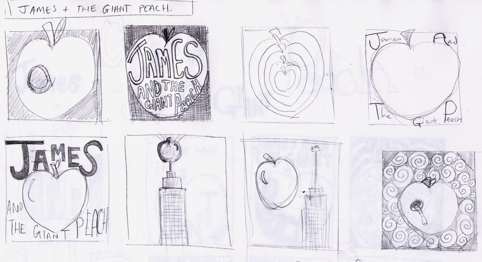
After looking at all the different competition briefs on offer I have decided to try the Penguin children's book competition, which this year is James and the Giant Peach. I am excited to take this on as it is a great story (one which I need to re-read asap) and is full of great imagery for me to get my teeth stuck into. So far I have just done a couple of sheets of thumbnails but watch this space for further progress. One thing that will be challenging on this brief is that one of the requirements is to have quite a bit of written information on the cover, including the title, author, illustrator etc. I have never really attempted to put typography in my work so it will be an interesting challenge. I have attempted to consider the type from the very beginning as to avoid it being an afterthought.