Here's an updated potential clients list:
Publication - "The Children's book"
Publisher - Vintage Publishing
Author - A.S Byatt
Publication - The Cardturner
Publisher - Bloomsbury
Author - Louis Sachar
Publication - Harry Potter Series
Publisher - Bloomsbury
Illustrator - Clare Melinsky
Publication - Robin Hobb Novels (Assassins Quest)
Publisher - Harper Collins/Harper Voyager
Monday 22 November 2010
Aubrey Beardsley - Inspiration for type


Due to the fact that a requirement of the penguin brief is to have quite a lot of text on the cover (author name, title etc) I have been looking to find some good examples of type that I really like. I was looking through an Aubrey Beardsley book just for general research as I really enjoy his fine line work, and I found some really nice examples of him using hand rendered type.
I really like how his type is cohesive with the rest of the image and looks just as natural and beautiful as the rest of his illustration. The letter forms are not at odds with the rest of image, nor do they compete for attention, and this is something I would like to be able to create in my own designs.
Competition Brief - James and The Giant Peach

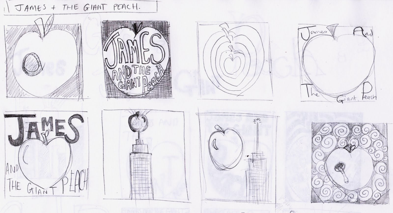
After looking at all the different competition briefs on offer I have decided to try the Penguin children's book competition, which this year is James and the Giant Peach. I am excited to take this on as it is a great story (one which I need to re-read asap) and is full of great imagery for me to get my teeth stuck into. So far I have just done a couple of sheets of thumbnails but watch this space for further progress. One thing that will be challenging on this brief is that one of the requirements is to have quite a bit of written information on the cover, including the title, author, illustrator etc. I have never really attempted to put typography in my work so it will be an interesting challenge. I have attempted to consider the type from the very beginning as to avoid it being an afterthought.
Thursday 18 November 2010
Dandi Palmer


Again perusing the AOI website... I have come across Dandi Palmer. Something that really caught my eye was Dandi's illustrations that were in a Celtic style. I really liked the intricate knotwork and fine line-work that is typical of that style and her black and white drawings really appeal to me with there textural qualities.
check Dandi's porfolio out here - http://www.aoiportfolios.com/artist/dandipalmer/
Thomas Flintham


While I was perusing the AOI portfolios online, I came across this chap named Thomas Flintham. I really admire his use of black and white and limited colour schemes. Also his line work that has a texture-like quality is something I really like and strive to create in my own work. His use of black and white is very bold and creates a dynamic ansd striking effect that I really enjoy while looking at his work.
You can check out his portfolio on the AOI website here - http://www.aoiportfolios.com/artist/thomasflintham/
Monday 15 November 2010
Stolen Peace Album Art

I have recently come across the opportunity to submit some artwork for the band "Stolen Peace" for their album "Bones" (if my work is chosen, obviously). I am quite excited about this as I am a fan of rock and roll and metal music so this is right up my street. Also the band has given a good idea of what they want on the album cover in terms of themes etc. One of the things that really grabbed my attention was that the album is named "Bones" because of the band feeling as if they have to give up the bones of who they are as people and musicians to get recognition in the industry. I think this is a great statement and will be trying to visually represent this in my artwork.
So here's a quick page of little sketches of my initial thoughts, they're all quite cliche with regards to rock and metal album covers, but, I really don't care. That's what I love about most album covers of that genre, straight to the point, no frills just cool as F**K images. I hope to express the the bands feelings in regards to giving up the bones of who they are, but at the same time I want it be a really cool, eye-catching image. Rest assured it wont be some abstract expressionist crap that takes four hours to explain.
Check out the Stolen Peace's website here and give them your support if you feel so inclined - www.stolenpeace.co.uk
ROCK AND ROLL
Saturday 13 November 2010
Potential Clients List
Here's a few potential clients that I've come across, I have chosen them based on the work on the publications either being similar to mine in style, or just the way they are presented reminding me of my own work in some way.
Author - A.S Byatt
Publication - "The Children's book"
Publisher - Vintage Publishing
Author - Louis Sachar
Publication - The Cardturner
Publisher - Bloomsbury
Author - A.S Byatt
Publication - "The Children's book"
Publisher - Vintage Publishing
Author - Louis Sachar
Publication - The Cardturner
Publisher - Bloomsbury
Negotiated Project - Final (ish) Illustrations


So, I've finished (sort of) the illustrations for the Negotiated Project, which for me, is images based on some quotes from Paradise Lost. We had the preliminary deadline and I handed my illustrations in, and I am quite happy about he feedback I have received. As far as the images are concerned I am pleased with them. There are some issues to iron out but on the whole, I think they are working well and fulfilling the brief that I initially set out. I have to find somewhere to get them nicely printed and bound though!
I have had a good experience on this project, learning some things along the way that has given me a clearer idea of my working method. For example, I was using the collograph technique to produce a "base" image. What I mean by this is that the printing technique created a textured background and solid shapes, and I was adding to this with hand rendered line work. As much as I love the collograph technique and I will definitely be using it in the future (in fact I think it has become a mainstay of my working method) I think I may have used it too much. When the background texture and main foreground shapes were on the same plate, it created problems. I had to discard some prints because, even though the main shapes looked really nice, the background was too dark, and so I couldn't really use it. If I had created these elements separately, then I could simply alter their levels digitally to fit.
Furthermore, I think I overused the collograph technique, because I could have created a similar effect in a much more time effective and efficient way. I really like the background texture, but this effect could be similarly created with a roller and some ink. In fact, I could even create several sheets of these textures and scan them, so that i would always have nice textures on hand.
So with regards to collographs, I will definitely be using them in the future, as I love the effect they produce and the analogue quirks that go with them. I really enjoy the "halo" of white space that the process leaves around shapes sometimes as well. However, I have (importantly) learned when to use the process, and when not to, and I think the things I have learned along the way on this project will be more valuable to me than the images I have produced.
PS - I am happy with the inclusion of the fine line work in these images as well, and feel good that it wasn't just a one trick pony with the 7x7 project. I enjoy using the fine line work and will seek to use it more and more in my work.
Subscribe to:
Posts (Atom)
